
MTPL2 Frequency Modelling Walkthrough#
End-to-end Poisson frequency model on the full French MTPL2 dataset (678k policies). Covers data prep, main-effect fitting, interaction fitting, static plots for export, Plotly exploration, contour/HDR interaction views, and discretising smooth curves into rating tables.
Sections:
Data loading & preparation
Model specification — splines, categoricals, and a spline-spline interaction
Fitting with REML — automatic smoothness selection on the full dataset
Plotting workflow — static charts, Plotly explorer, contour/HDR interaction view, plot-data export
Summary table — statsmodels-style output
Discretisation impact — binning smooth curves into rating tables
Rating tables — per-feature step functions for deployment
import time
from pathlib import Path

import matplotlib.pyplot as plt
import numpy as np
import pandas as pd

from superglm import Categorical, Poisson, Spline, SuperGLM
1. Data loading & preparation#
The French MTPL2 frequency dataset contains 678k motor third-party liability policies with claim counts and exposure. We use the local parquet copy when available and fall back to OpenML otherwise, then apply the standard actuarial cleaning used throughout the repo.
from sklearn.datasets import fetch_openml

DATA_PATH = Path("../../data/freMTPL2freq.parquet")

if DATA_PATH.exists():
    df = pd.read_parquet(DATA_PATH)
else:
    df = fetch_openml(data_id=41214, as_frame=True, parser="auto").frame

# Standard cleaning
claim_count = df["ClaimNb"].astype(float).clip(upper=4)
exposure_series = df["Exposure"].astype(float).clip(lower=0.01)
df["ClaimNb"] = claim_count
df["Exposure"] = exposure_series
df["DrivAge"] = df["DrivAge"].astype(float).clip(18, 90)
df["VehAge"] = df["VehAge"].astype(float).clip(0, 20)
df["BonusMalus"] = df["BonusMalus"].astype(float).clip(50, 150)
df["Density"] = df["Density"].astype(float)
df["VehPower"] = df["VehPower"].astype(float)
df["LogDensity"] = np.log1p(df["Density"])

y = (df["ClaimNb"] / df["Exposure"]).to_numpy(dtype=np.float64)
exposure = df["Exposure"].to_numpy(dtype=np.float64)

features_to_use = ["DrivAge", "VehAge", "BonusMalus", "LogDensity", "Area", "VehPower"]
X = df[features_to_use].copy()

print(f"Rows: {len(df):,}")
print(f"Claim frequency: {df['ClaimNb'].sum() / df['Exposure'].sum():.4f}")
print(f"Zero-claim fraction: {(df['ClaimNb'] == 0).mean():.1%}")
X.describe(include="all").transpose()
Rows: 678,013
Claim frequency: 0.1006
Zero-claim fraction: 95.0%
| count | unique | top | freq | mean | std | min | 25% | 50% | 75% | max | |
|---|---|---|---|---|---|---|---|---|---|---|---|
| DrivAge | 678013.0 | NaN | NaN | NaN | 45.496871 | 14.129872 | 18.0 | 34.0 | 44.0 | 55.0 | 90.0 |
| VehAge | 678013.0 | NaN | NaN | NaN | 6.976124 | 5.398963 | 0.0 | 2.0 | 6.0 | 11.0 | 20.0 |
| BonusMalus | 678013.0 | NaN | NaN | NaN | 59.757211 | 15.607906 | 50.0 | 50.0 | 50.0 | 64.0 | 150.0 |
| LogDensity | 678013.0 | NaN | NaN | NaN | 5.992367 | 1.856253 | 0.693147 | 4.532599 | 5.976351 | 7.41397 | 10.203629 |
| Area | 678013 | 6 | C | 191880 | NaN | NaN | NaN | NaN | NaN | NaN | NaN |
| VehPower | 678013.0 | NaN | NaN | NaN | 6.454631 | 2.050906 | 4.0 | 5.0 | 6.0 | 7.0 | 15.0 |
2. Model specification#
A practical full-sample MTPL2 frequency model mixes smooth main effects, a categorical region effect, and one continuous × continuous interaction:
Term |
Type |
Why |
|---|---|---|
DrivAge |
|
Smooth driver-age effect |
VehAge |
|
Smooth vehicle-age effect |
BonusMalus |
|
Strong nonlinear tariff effect |
LogDensity |
|
Smooth urbanicity effect |
Area |
|
Geographic rating regions |
VehPower |
|
Smooth power effect |
DrivAge:VehAge |
tensor interaction |
Joint age surface for drivers and vehicles |
model = SuperGLM(
    family=Poisson(),
    selection_penalty=0,
    discrete=True,
    features={
        "DrivAge": Spline(n_knots=10, penalty="ssp"),
        "VehAge": Spline(n_knots=8, penalty="ssp"),
        "BonusMalus": Spline(n_knots=8, penalty="ssp"),
        "LogDensity": Spline(n_knots=7, penalty="ssp"),
        "Area": Categorical(base="first"),
        "VehPower": Spline(n_knots=7, penalty="ssp"),
    },
    interactions=[("DrivAge", "VehAge")],
)
print("Model specified.")
Model specified.
3. Fitting with REML#
fit_reml() estimates smoothing parameters automatically via restricted
marginal likelihood (Wood 2011). For count frequency work we model claim
rate (ClaimNb / Exposure) and pass exposure through sample_weight=.
This notebook uses the full MTPL2 dataset and includes one spline-spline interaction, so the fit may take a little while.
t0 = time.perf_counter()
model.fit_reml(X, y, sample_weight=exposure, max_reml_iter=6)
elapsed = time.perf_counter() - t0

print(f"Fit time: {elapsed:.1f}s")
print(f"REML converged: {model._reml_result.converged}")
print(f"REML iterations: {model._reml_result.n_reml_iter}")
print()
print("Per-feature edf:")
for name in model._feature_order:
    ti = model.term_inference(name, with_se=False)
    edf_str = f"{ti.edf:.1f}" if ti.edf is not None else "—"
    print(f"  {name:15s} edf = {edf_str}")
print()
print(f"Interactions: {list(model._interaction_order)}")
Fit time: 7.0s
REML converged: False
REML iterations: 6

Per-feature edf:
  DrivAge         edf = 9.3
  VehAge          edf = 10.8
  BonusMalus      edf = 9.7
  LogDensity      edf = 1.2
  Area            edf = 5.0
  VehPower        edf = 8.5

Interactions: ['DrivAge:VehAge']
4. Plotting workflow#
4a. All main effects in a static grid#
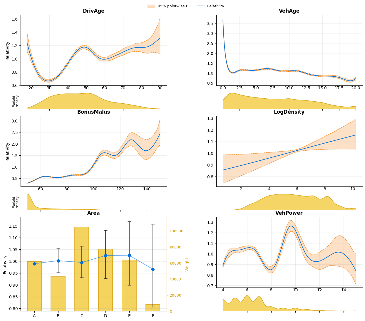
The default model.plot() remains the export-friendly path: a matplotlib
figure with main effects, density overlays, and confidence intervals.
fig = model.plot(
    X=X,
    sample_weight=exposure,
    figsize=(15, 12),
)
fig.subplots_adjust(wspace=0.34, hspace=0.24)
plt.show()
4b. Plotly multi-term explorer#
For interactive inspection, engine="plotly" is the multi-term main-effect
explorer path. This gives a term dropdown plus a response/link scale toggle.
fig = model.plot(
    engine="plotly",
    X=X,
    sample_weight=exposure,
    ci="pointwise",
    show_knots=True,
)
fig
4c. Continuous interaction contour + exposure HDR view#
For spline-spline interactions, Plotly can render a side-by-side figure with an interaction contour on the left and exposure highest-density-region (HDR) mass contours on the right.
fig = model.plot(
    "DrivAge:VehAge",
    engine="plotly",
    interaction_view="contour_pair",
    X=X,
    sample_weight=exposure,
    n_points=220,
)
fig
4d. Exporting raw plot data#
model.plot_data() returns the underlying x/y/grid data so you can rebuild
charts outside SuperGLM in matplotlib, plotly, Excel, or another reporting
stack.
payload = model.plot_data("DrivAge:VehAge", X=X, sample_weight=exposure, n_points=220)
print(payload["effect"].head())
print()
print(payload["density"].head())
     DrivAge  VehAge  relativity  log_relativity
0  18.000000     0.0    0.704085       -0.350856
1  18.328767     0.0    0.712220       -0.339369
2  18.657534     0.0    0.720476       -0.327843
3  18.986301     0.0    0.728852       -0.316285
4  19.315068     0.0    0.737343       -0.304702

     DrivAge  VehAge   density  hdr_mass
0  18.000000     0.0  0.037695  0.993639
1  18.328767     0.0  0.042701  0.992064
2  18.657534     0.0  0.048154  0.990180
3  18.986301     0.0  0.054063  0.987856
4  19.315068     0.0  0.060433  0.985071
5. Summary table#
statsmodels-style summary with coefficient estimates, smooth term edf, and Wood (2013) p-values for smooth terms.
model.summary()
| SuperGLM Results | |||||||
| Family: | Poisson | No. Observations: | 678013 | ||||
| Link: | Log | Df (effective): | 64.18 (39.51 smooth) | ||||
| Method: | REML, discrete | Penalty: | None | ||||
| Scale (phi): | 1.000 | Pearson chi2: | 1410069.5 | ||||
| Log-Likelihood: | -130663.1 | AIC: | 261454.6 | ||||
| AICc: | 261454.6 | BIC: | 262188.0 | ||||
| EBIC: | 262188.0 | Converged: | True (2 iter) | ||||
| Deviance: | 211532.1 | ||||||
| coef | std err | z | P>|z| | [0.025 | 0.975] | ||
| Intercept | -2.3609 | 0.0382 | -61.855 | 0.000 | -2.436 | -2.286 | *** |
| DrivAge | |||||||
| DrivAge | [spline, 13 params, χ²(10.4)=1019.6, p=<0.001] rank=13, edf=9.3, λ=12, curve SE: 0.01–0.10 | *** | |||||
| VehAge | |||||||
| VehAge | [spline, 11 params, χ²(10.9)=6985.6, p=<0.001] rank=11, edf=10.8, λ=0.065, curve SE: 0.01–0.07 | *** | |||||
| BonusMalus | |||||||
| BonusMalus | [spline, 11 params, χ²(10.1)=5402.1, p=<0.001] rank=11, edf=9.7, λ=0.49, curve SE: 0.01–0.13 | *** | |||||
| LogDensity | |||||||
| LogDensity | [spline, 10 params, χ²(1.1)=5.6, p=0.017] rank=10, edf=1.2, λ=1.3e+04, curve SE: 0.01–0.07 | * | |||||
| Area | |||||||
| Area[B] | 0.0130 | 0.0260 | 0.498 | 0.619 | -0.038 | 0.064 | |
| Area[C] | 0.0055 | 0.0342 | 0.160 | 0.873 | -0.062 | 0.072 | |
| Area[D] | 0.0342 | 0.0509 | 0.673 | 0.501 | -0.065 | 0.134 | |
| Area[E] | 0.0354 | 0.0670 | 0.528 | 0.597 | -0.096 | 0.167 | |
| Area[F] | -0.0237 | 0.0920 | -0.258 | 0.797 | -0.204 | 0.157 | |
| VehPower | |||||||
| VehPower | [spline, 10 params, χ²(9.0)=271.5, p=<0.001] rank=10, edf=8.5, λ=1.2, curve SE: 0.01–0.09 | *** | |||||
| DrivAge:VehAge | |||||||
| DrivAge:VehAge | -0.0136 | 0.0537 | -0.253 | 0.801 | -0.119 | 0.092 | |
| Signif. codes: 0 '***' 0.001 '**' 0.01 '*' 0.05 '.' 0.1 ' ' 1 | |||||||
| Note: smooth p-values use Wood (2013) Bayesian test. Parametric p-values are Wald approximations. For borderline significance, use a likelihood ratio test. | |||||||
6. Discretisation impact#
In production, smooth spline curves are typically discretised into
step-function rating tables (for example 10–20 age bands).
discretization_impact() covers every smooth term a rating table
approximates — the spline and polynomial main effects, and the
DrivAge×VehAge interaction, which is sampled onto an
n_bins-per-axis grid rather than binned into intervals. Its metrics are
joint over everything discretised in the call.
This section wants the main effects’ binning error on its own, so that the
step-function plots below compare like with like, so it fits a companion
main-effects-only model with the same feature set. Run the diagnostic on
model instead to see the interaction’s share included — its grid appears
in result.interaction_tables, keyed on "DrivAge:VehAge".
t0 = time.perf_counter()
main_effect_model = SuperGLM(
    family=Poisson(),
    selection_penalty=0,
    discrete=True,
    features={
        "DrivAge": Spline(n_knots=10, penalty="ssp"),
        "VehAge": Spline(n_knots=8, penalty="ssp"),
        "BonusMalus": Spline(n_knots=8, penalty="ssp"),
        "LogDensity": Spline(n_knots=7, penalty="ssp"),
        "Area": Categorical(base="first"),
        "VehPower": Spline(n_knots=7, penalty="ssp"),
    },
)
main_effect_model.fit_reml(X, y, sample_weight=exposure, max_reml_iter=6)
print(f"Companion main-effect fit time: {time.perf_counter() - t0:.1f}s")
print()
# Compare bin counts: how many bins before the error is negligible?
for n_bins in [5, 10, 20, 50, 100]:
    r = main_effect_model.discretization_impact(X, y, sample_weight=exposure, n_bins=n_bins)
    m = r.metrics
    print(
        f"  {n_bins:3d} bins: "
        f"deviance change {m['deviance_change_pct']:+.4f}%, "
        f"mean pred change {m['mean_abs_prediction_change_pct']:.4f}%, "
        f"corr {m['prediction_correlation']:.6f}"
    )
Companion main-effect fit time: 1.4s
    5 bins: deviance change +3.3565%, mean pred change 24.5309%, corr 0.596113
   10 bins: deviance change +0.8147%, mean pred change 10.2954%, corr 0.901808
   20 bins: deviance change +0.4735%, mean pred change 6.1482%, corr 0.937927
   50 bins: deviance change +0.1276%, mean pred change 1.9306%, corr 0.981421
  100 bins: deviance change +0.0781%, mean pred change 1.3647%, corr 0.982596
7. Rating tables#
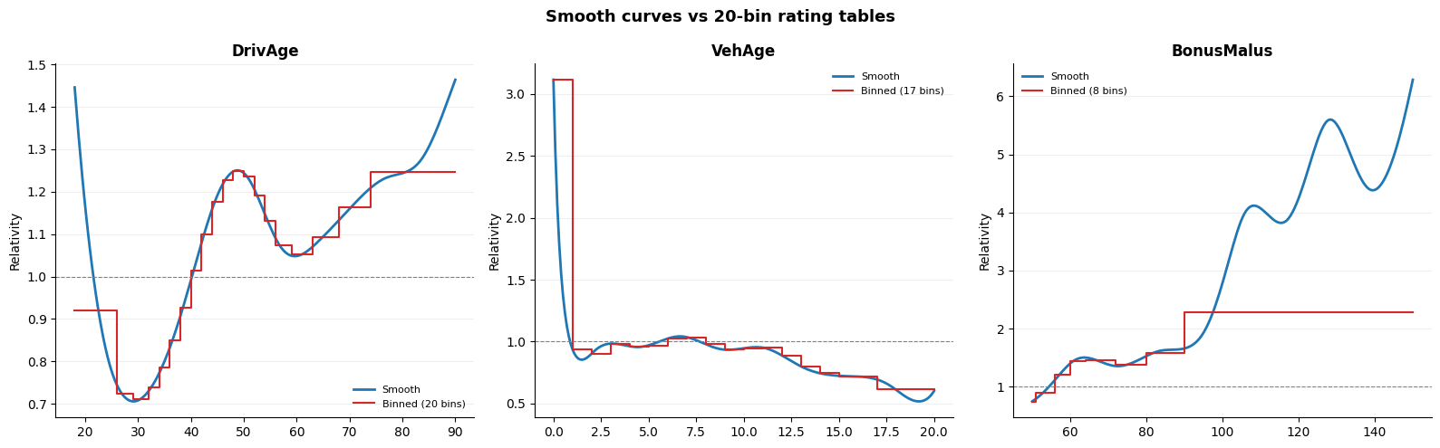
Using the companion main-effects-only fit, we can compare the smooth curves with the 20-bin rating tables that would be exported for deployment.
result = main_effect_model.discretization_impact(X, y, sample_weight=exposure, n_bins=20)

spline_names = ["DrivAge", "VehAge", "BonusMalus"]
fig, axes = plt.subplots(1, 3, figsize=(16, 5))

for ax, name in zip(axes, spline_names):
    # Smooth curve on native scale (no mean centering) to match rating table
    ti = main_effect_model.term_inference(name, centering="native")
    ax.plot(ti.x, ti.relativity, color="#1f77b4", linewidth=2, label="Smooth")

    # Step function from rating table
    table = result.tables[name]
    step_x, step_y = [], []
    for _, row in table.iterrows():
        step_x.extend([row["bin_from"], row["bin_to"]])
        step_y.extend([row["relativity"], row["relativity"]])
    ax.plot(step_x, step_y, color="#d62728", linewidth=1.5, label=f"Binned ({len(table)} bins)")

    ax.axhline(1.0, color="grey", linewidth=0.8, linestyle="--")
    ax.set_title(name, fontweight="bold")
    ax.set_ylabel("Relativity")
    ax.legend(fontsize=8, frameon=False)
    ax.grid(alpha=0.2, axis="y")
    ax.spines["top"].set_visible(False)
    ax.spines["right"].set_visible(False)

fig.suptitle("Smooth curves vs 20-bin rating tables", fontweight="bold", fontsize=13)
fig.tight_layout()
plt.show()
8. Key takeaways#
Detail |
|
|---|---|
REML |
Automatic smoothness selection on the full MTPL2 frequency model |
Static plots |
|
Interactive plots |
|
Plot data export |
|
Discretisation |
10–20 bins per feature is enough for tiny approximation error |
The smooth model is the statistical model. The rating table is what goes into production pricing. SuperGLM now supports the full path from full-data MTPL2 fit, to interactive inspection, to exportable figures, to raw plot payloads, to deployment-oriented rating tables.