Plot#
plot() is the single entry point for drawing
terms: all main effects, one, a subset, or an interaction, with pointwise or
simultaneous bands on the main effects.
plot_data() returns the plain DataFrames, arrays
and metadata behind those figures so you can rebuild them in matplotlib,
plotly, Excel or a reporting system.
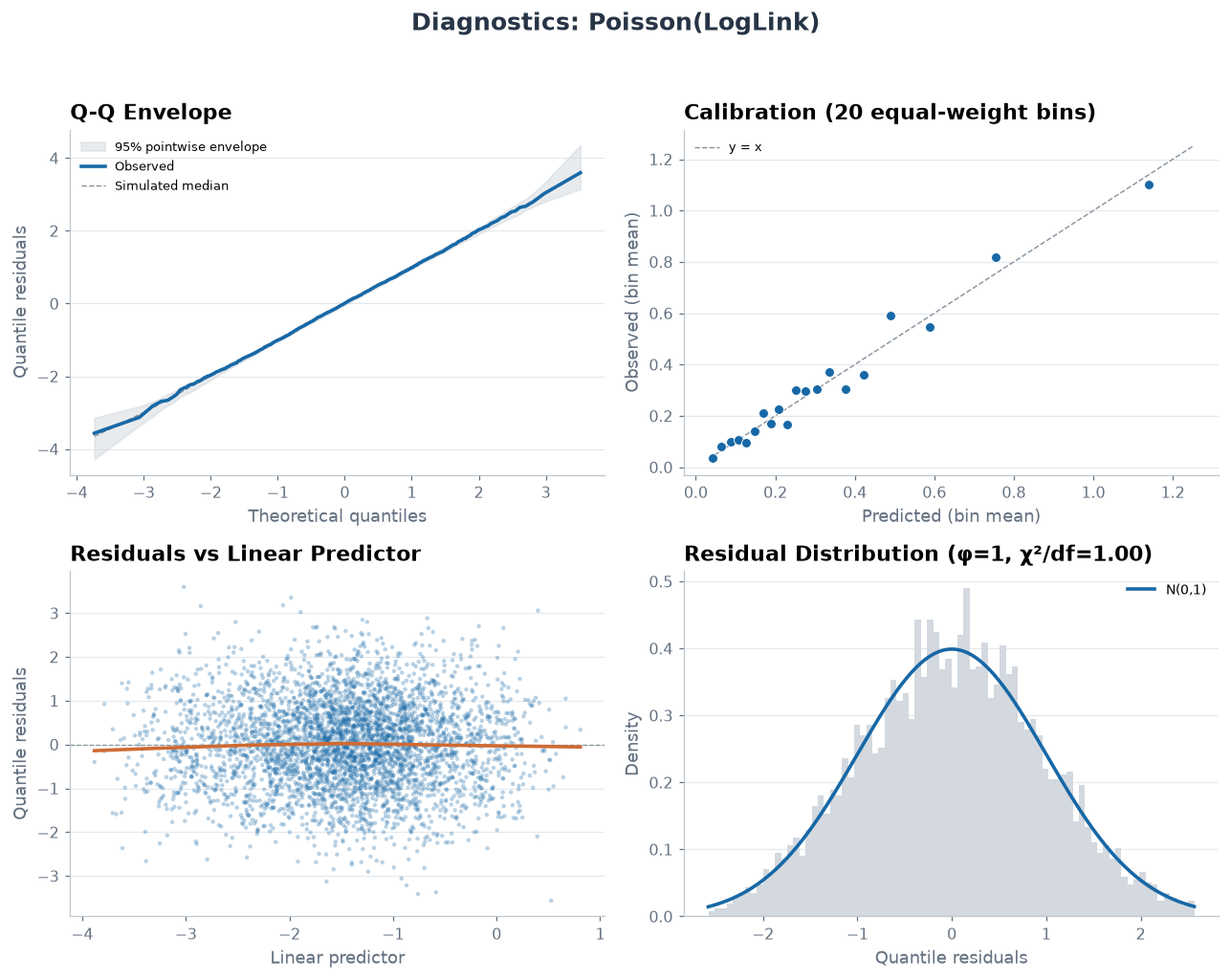
plot_diagnostics() is the four-panel residual
figure on quantile residuals, with a simulation-based Q-Q envelope.
Plot model terms. |
|
Return plain data needed to recreate SuperGLM plots. |
|
GLM/GAM diagnostic figure with simulation-based Q-Q envelope. |
Example#
The same simulated motor book as the rest of this section: 4,000 policies, a non-linear age effect, four regions and a mild vehicle-power slope, with exposure carried as a log offset.
import numpy as np
import pandas as pd

from superglm import Categorical, Numeric, Spline, SuperGLM

rng = np.random.default_rng(0)
n = 4000
region = rng.choice(["North", "South", "East", "West"], n, p=[0.35, 0.3, 0.2, 0.15])
age = rng.uniform(18, 80, n)
veh_power = rng.uniform(4, 12, n)
exposure = rng.uniform(0.1, 1.0, n)
region_effect = pd.Series(region).map(
    {"North": 0.0, "South": 0.25, "East": -0.2, "West": 0.4}
).to_numpy()
log_rate = (
    -1.2
    + 1.1 * np.exp(-((age - 24) ** 2) / 90.0)
    + 0.004 * (age - 50) ** 2 / 10.0
    + region_effect
    + 0.09 * (veh_power - 8)
)
claims = rng.poisson(np.exp(log_rate) * exposure)
X = pd.DataFrame({"age": age, "region": region, "veh_power": veh_power})
offset = np.log(exposure)

model = SuperGLM(
    family="poisson",
    features={
        "age": Spline(kind="cr", k=10),
        "region": Categorical(),
        "veh_power": Numeric(),
    },
).fit_reml(X, claims, offset=offset)
model.reml_diagnostics()["converged"]
True
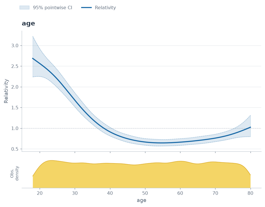
One named term draws one figure: the fitted age curve with its pointwise band
and, because X was passed, the density of the fitting rows underneath, so a
thin stretch of data cannot masquerade as a confident part of the curve. Drop
the term name to draw every main effect, pass a list for a subset, and pass
ci="simultaneous" for bands that hold jointly across the curve.
fig = model.plot("age", X=X, engine="matplotlib")
plot_data returns the numbers behind that figure instead of drawing it: one
entry per term, each with the effect frame, the density, and the metadata
describing how the curve was centred and how much of the basis the fit used.
Nothing in it needs SuperGLM to render — this is the handover to plotly, Excel
or a reporting system.
payload = model.plot_data("age", X=X)
age_term = payload["terms"][0]
print(
    f"kind={payload['kind']}, centering={age_term['metadata']['centering_mode']}, "
    f"edf={age_term['metadata']['edf']:.2f}"
)
age_term["effect"].head().round(3)
kind=main_effects, centering=training_mean_zero_unweighted, edf=4.58
| x | log_relativity | relativity | se_log_relativity | ci_lower | ci_upper | |
|---|---|---|---|---|---|---|
| 0 | 18.007 | 0.988 | 2.687 | 0.093 | 2.240 | 3.223 |
| 1 | 18.318 | 0.981 | 2.668 | 0.088 | 2.244 | 3.171 |
| 2 | 18.630 | 0.974 | 2.649 | 0.084 | 2.248 | 3.121 |
| 3 | 18.941 | 0.967 | 2.630 | 0.079 | 2.251 | 3.073 |
| 4 | 19.253 | 0.960 | 2.611 | 0.075 | 2.252 | 3.026 |
plot_diagnostics is the residual view rather than the effect view: four
panels on quantile residuals, with the Q-Q panel carrying an envelope
simulated from the fitted model, so the question “is this tail worse than this
model would produce anyway” has an answer on the page. It needs the frame and
the response back, because residuals are not stored on the model.
diagnostics = model.plot_diagnostics(X, claims, offset=offset)